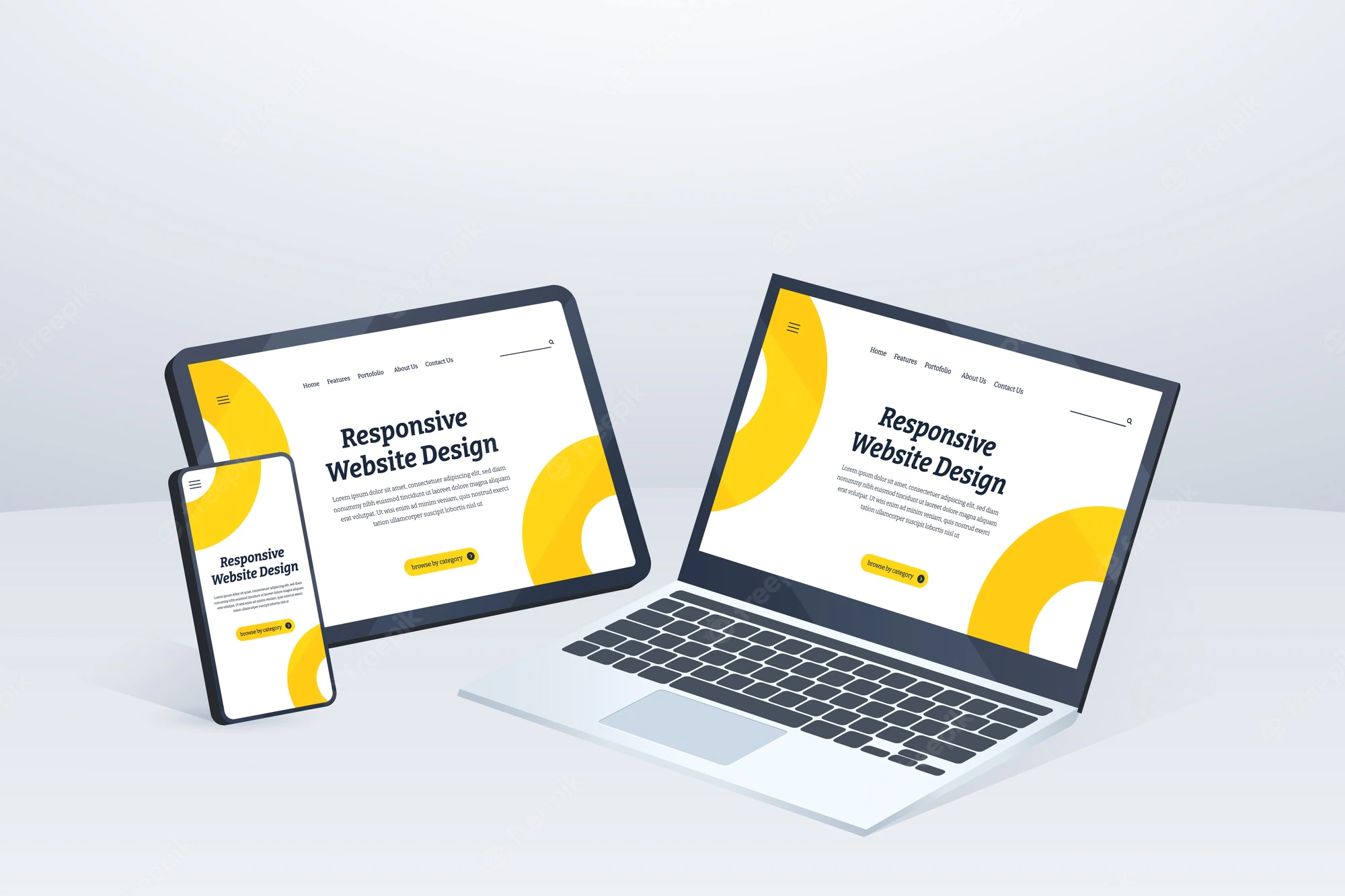
Responsive web design (RWD) is an approach to designing and building websites that allows them to adapt to different screen sizes and devices. This is achieved by using a combination of flexible grids, images, and CSS media queries.
The flexible grid allows elements on the website to adjust their size and position based on the size of the screen, while media queries allow the website to apply different CSS styles based on the characteristics of the device, such as screen size and resolution. This allows the website to automatically adjust its layout and functionality to provide the best possible user experience on any device.
Responsive web design is important because it ensures that a website can be easily viewed and interacted with on a variety of devices and screen sizes, including desktop computers, laptops, tablets, and smartphones.
This allows for a better user experience, as users can easily access and navigate the website regardless of the device they are using. Additionally, responsive design improves the website’s search engine optimization (SEO) and makes it more likely to rank higher in search engine results, as search engines favor mobile-friendly websites.
Responsive web design is a method of designing and developing websites that adapt to the layout and functionality of various devices and screen sizes, such as smartphones, tablets, and desktop computers. This approach uses flexible grids, images, and CSS media queries to create a website that adjusts its layout and content based on the viewer’s device and screen size, providing a consistent and optimal viewing experience across all devices.
It is important for any website to be responsive because it ensures that the website is accessible and easy to use for visitors on any device. With the increasing use of mobile devices to access the internet, it is essential for websites to be optimized for smaller screens and touch navigation.
A responsive design ensures that a website will look and function correctly on any device, and it improves the user experience for visitors on all devices. Additionally, responsive design can also improve the website’s search engine optimization and can increase the website’s visibility on search engines.
There are certain benefits of a responsive design, such as improved user experience, increased accessibility, and better search engine visibility.
We at Dweb Consult ensures that all the website designed are responsive on all the screen sizes to create a BETTER VIEW!